
✨CLICK HERE TO SEE A COMPLETE LIST OF THE BLOGIFUL DESIGN POSTS.✨
→ Introducing The Blogiful Blog Design Event
→ 5 Steps That Will Help You Choose An Awesome Blog Name (ft. A Free Worksheet!)
→ How to Choose the Right Font for Your Blog
→ How in the World I Make My Graphics: A Step-By-Step Tutorial
→ My Branding Journey + Four Questions To Ask Yourself While Rebranding (ft. A Free Downloadable Checklist)
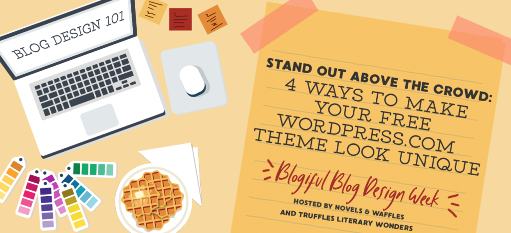
→ 4 Ways To Make Your Free WordPress.com Theme Look Different From Everybody Else’s
→ An Interview with Web Designer, Hazel From Stay Bookish
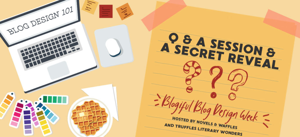
→ Q & A Session + A Secret Reveal

Also, if you know what this is from, then I will be your BFF Jill forever.
*In my best newscaster voice* Good evening, Internet. I’m Kat and this is Novels & Waffles. Joining me here in the studio is the talented web designer, Hazel from the blog, Stay Bookish. Thank you, Hazel, for kindly agreeing to talk with me tonight. I know that I, for one, am excited to hear what you have to say about designing. Without further ado, let’s get this interview started.
Okay, let’s start off with something easy (or if you’re like me and struggle with introducing yourself – something difficult). Please tell me a little about yourself and your journey with blog/web design. How did you get to where you are today?

Hello Kat and Kat’s lovely readers! I’m Hazel and I blog at Stay Bookish, where I run a design business on the side, helping book bloggers and authors with their design needs. Though I started blogging in 2013, I didn’t start designing for others until two years later, when my readers and followers took notice of my blog’s own creativity and started asking if I could help with theirs.
But that’s just how I became a designer who works with clients. My journey to actually growing my passion for design started when I was in 6th grade when I started tweaking one of my very first internet profiles on a social site that’s now nonexistent. I mostly taught myself everything I needed to know about graphic and web design from then on til now, though I did take a super basic course on Photoshop my freshman year in high school. Funnily enough, I still followed a medical career path despite my love for creative arts, but here I am anyway: a freelance designer who gets to work with fellow creators who are also wonderful, bookish people.
Over the years, I’m sure you’ve designed many different websites and graphics. If you had to choose, what is the project that you are personally the most proud of?
The obvious answer (at least for anyone who’s peeked at my portfolio) is designing Pop! Goes The Reader. The very idea of Jen, who’s seriously one of the best book bloggers I know, just trusting me to work on her site is already something to be proud of, but hearing from her readers how beautiful they find her blog when I helped with its design just makes me so happy.
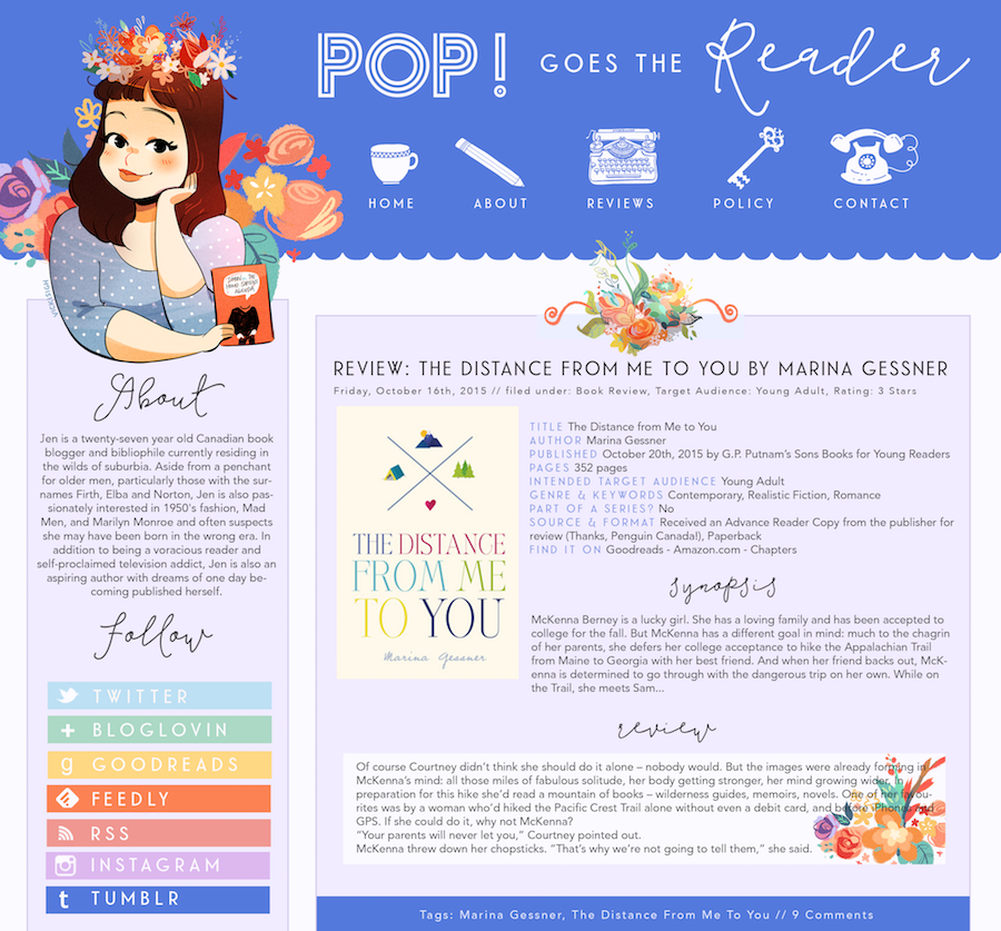
I can’t take credit for the illustrations, which were drawn by the incredible Vicki Sigh, and I must note that Jen herself has an amazing eye for design as well (though this of course challenged me to do the best I can to live up to her standards). But being the designer/developer for this project, I realized that design is not just creating the graphics—the most important thing is creating a cohesive brand that stands out. Which I think I managed to do in this case, not just from client feedback, but also based on a huge audience response, so that’s why I’m really proud of it.
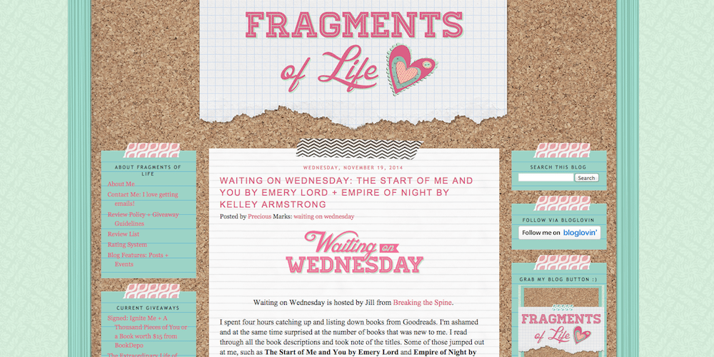
The obscure answer is working on Fragments of Life. I’ve always wanted to do a corkboard theme blog design! And the fact that I built the design on Blogger (where it’s not as easy to code/develop, unlike WordPress) is a real feat for me too.
As we learn from the Disney movie, Hercules : “A hero is only as good as his weapon!” (Sorry, my nerd is showing). What would you say are some of the most helpful weapons tools that you use while designing?

None of my designs would be possible without Photoshop. For my design materials, like fonts, patterns, and illustrations, I rely on Creative Market. When I need design inspiration, I head over to Pinterest and browse around for aesthetics. I also use it to collect possible resources and create private moodboards for design projects. To get organized, I use FontBase for my font collections and then Coolors for my color palettes.
According to internet experts, there are almost 2 billion total websites online. That’s a lot of blogs! In your opinion, how can book bloggers (or just bloggers in general) create a website/brand that stands out?

Having branded visuals in the first place! To point out a more concrete example, just look at the what’s working very well for bookstagram: having themed feeds. The same is true for blogs. You need to develop a theme or a brand for your site. Start with colors that represent your content. Then, choose a style (do you want a hand drawn or clean and crisp look for graphics and fonts? Minimalist or glamorous?) and stick with it. This will elevate your brand and make it memorable. But to really stand out, your brand must be uniquely you, so follow your heart instead of trends.
What are some design tips you wish you knew when you first started your blog? {AKA: PLEASE SHARE SOME OF YOUR INFINITE DESIGN WISDOM WITH US!}
Colors are so important! Not just because people will remember your blog because of it (for example if you have a main color that’s purple they’ll think of you as the one with the purple blog or if you have lots of color they’ll think of your blog as the colorful one), but because they can also affect how you view your own blog and end up limiting you. (Dark blog? It might make you feel weird when you have to post a review for a bright, light contemporary and vice versa. So it’s good to have a balance.) Visual elements like icons and illustrations really add to the design even when used for small details. Don’t just settle for a main illustration on the logo and header typography. Hold back on using gradients and paper textures, they get old real fast.
Okay, last one: If you had to make a list of graphic design rules (as told by Hazel), what would they be? (That totally sounds like a BuzzFeed article, doesn’t it? “Hazel’s Top Graphic Design Rules You Should Never Break” haha).
- Don’t resize graphics/illustrations/texts without following its ratio.
- Give breathing room. Make use of margins and padding around, between
- It’s okay to use a mix of fonts but don’t use more than one of a certain style. (Can you imagine using two different script fonts for one design? Or several geometric/decorative fonts? shudders).
- Textures are good, better when subtler, and are best when used in moderation.
- Don’t add letter spacing for script fonts, the letters are supposed to be connected.
- Only use seamless patterns.
- Don’t imitate, innovate instead.

Hazel’s Book Blog // Hazel’s Design Store // Hazel’s Twitter // Hazel’s Instagram // Hazel’s Pinterest
✨Don’t forget to check out my lovely Co-Host’s corresponding Blogiful post for today, where she explains coding for beginners ✨
17 Comments
Write Your Waffling


Trending Posts


Kat this was really insightful! Thank you so much for this interview.
Oh thank you for this amazing Interview!!! 😍 I use the WordPress free themes because I cannot afford the other options so this was really helpful!! 😊
I absolutely live by free WordPress themes. There’s so much you can do with them if you try. I honestly wouldn’t be where I am if I didn’t try so hard to learn how to tweak the hell out of my free theme and just went for a paid one.
Entered and loved this post! I know I’m one of those people who love all the blog designs but have no experience and gets intimidated lol. But you guys are amazing :D
Miraculous 😉
But great tips – I’m currently *trying* to redesign my blog but keep it on the down low so I can forget it quickly if it all goes terrible!
OMG I AM ADDICTED TO MIRACULOUS!! 🐞🐱💕
This was a lovely interview. And Hazel had some beautiful blog designs!! 😍 I liked the point that main colours could effect what you write about– I hadn’t thought about that.
And I love that you can use a Pinterest board for inspiration– I love Pinterest!! ❤
Ahh you’re too kind! Thank you so much for checking this out –– I’m so glad you took away a few things from it!
You’re welcome!! I really enjoyed reading it!! 💛
KAT! This might be my favorite interview I’ve ever done and I SQUEALED when I saw your newscasting graphic as well as our delightful interview at the studio 😉 Thank you so much for having me and congrats on your successful Blogiful event! 💕
[…] → 4 Ways To Make Your Free WordPress.com Theme Look Different From Everybody Else’s → An Interview with Web Designer, Hazel From Stay Bookish → Q & A Session + A Secret […]
[…] → 4 Ways To Make Your Free WordPress.com Theme Look Different From Everybody Else’s → An Interview with Web Designer, Hazel From Stay Bookish → Q & A Session + A Secret […]
[…] → 4 Ways To Make Your Free WordPress.com Theme Look Different From Everybody Else’s → An Interview with Web Designer, Hazel From Stay Bookish → Q & A Session + A Secret Reveal Okay, I give you permission to groan loudly at my pun […]
[…] → 4 Ways To Make Your Free WordPress.com Theme Look Different From Everybody Else’s → An Interview with Web Designer, Hazel From Stay Bookish → Q & A Session + A Secret […]
[…] → 4 Ways To Make Your Free WordPress.com Theme Look Different From Everybody Else’s → An Interview with Web Designer, Hazel From Stay Bookish → Q & A Session + A Secret […]
[…] → 4 Ways To Make Your Free WordPress.com Theme Look Different From Everybody Else’s → An Interview with Web Designer, Hazel From Stay Bookish → Q & A Session + A Secret […]
[…] → 4 Ways To Make Your Free WordPress.com Theme Look Different From Everybody Else’s → An Interview with Web Designer, Hazel From Stay Bookish → Q & A Session + A Secret […]