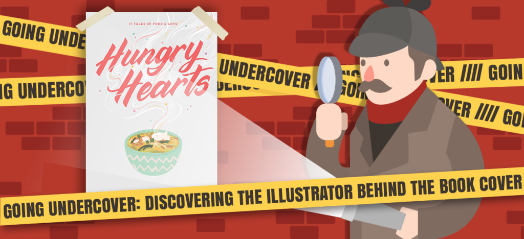


You probably didn’t recognize me at first because I’ve been MIA for so long of my insanely clever disguise (the fake mustache is very convincing, wouldn’t you say?). Step aside James Bond; clearly I was born to be an undercover agent. Even I’m floored by my amazing camouflage skills.

Right about now you’re probably wondering, “That’s very nice Kat, but why exactly are you wearing a mustache?” And the answer to that, dear reader, is this: I look fabulous it’s time for the next installment of my “Going Undercover” blog feature!
In case you missed it, “Going Undercover” is a feature here on Novels & Waffles where I interview the many wonderful artists behind the book covers that we adore so much. Hopefully, this will better connect the illustration community with the book community, help foster mutual support, and spotlight creators of all kinds.
So, without further ado, let’s turn the time over to today’s wonderful guest, Mirelle Ortega!
The Interview
Let’s start off with something easy (or if you’re like me and struggle with introducing yourself – something difficult). Please tell me about yourself and how you broke into this industry.
Hi! I’m Mirelle Ortega and I’m an illustrator based on Los Angeles, California. I’m originally from Veracurz, Mexico. I went to college for Animation back in Mexico, and I worked as a full-time illustrator in a small studio/company in Mexico City before coming to the US to get an MFA for Visual Development.
I was always very curious about children’s books illustration, so I started to research about it. One google search lead to another, until I bumped into the Children’s Writer and Illustrator’s Market book. That book really helped me understand the industry and I started building a portfolio with the hopes of querying agents. {Kat: The power of books is real, folks!}
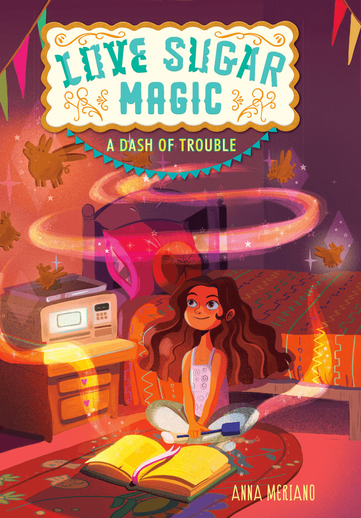
I got my break when I was approached by Harper Collins to create the cover art for Love, Sugar, Magic! (The author, Anna Meriano, found me through Twitter!), around that same time I applied to and was offered representation at Bright Agency, and I’ve been working with them ever since.
Most of us readers know very little about how a book cover comes into existence. Can you explain the process behind the A Dash of Trouble and A Sprinkle of Spirits covers?
For A Dash of Trouble, the art director for the project (Sarah Kaufman, she’s amazing!) had a very specific idea of what she wanted, so it made my job a lot easier. I was sent the manuscript and the character descriptions, I read the book, and then started sketching for Leo (the book’s main character). I really like reading the book, because I really want to embody the whole of the story in the cover, even though I’m only drawing from a specific moment.
Next, I sent over some sketches for the cover based on the descriptions I was given, and we started tweaking from there. We really wanted Leo’s design to be very unique, so the composition was easy to figure out, but we did a couple rounds of revisions on her final design. After that, I sent a color sketch, and when that was approved, I moved on to final art. This was my favorite part because I love working with color, and it was super fun finding ways to create magical effects.
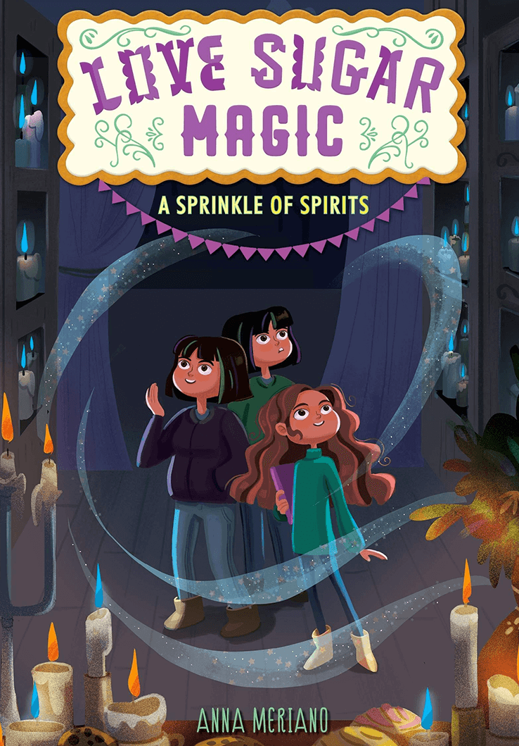
For A Sprinkle of Spirits , the process was similar, but faster, because I already knew what Leo was going to look like. I didn’t get the full manuscript for this book, so I didn’t get to read it beforehand. I did get to read the chapter from which the cover is drawn from, though! I don’t think I did a color sketch for this one, but I think maybe I described the colors I had in mind before moving forward with color.
As the saying goes, “It takes a village to raise a child.” Who else did you work with to create the covers for the Love Sugar Magic series and what was it like?
The designer for Love, Sugar, Magic! is Sarah Kaufman and she is the best! She’s great at giving feedback and she’s always very specific about what she would like to see in a sketch without constraining your creative input. The logo design is Jessie Gang, and even though I didn’t work with her directly, I’m a fan of her work!
There’s also Alison Donalty who’s an art director at HarperCollins. She’s also amazing; the entire design team there is super supportive and full of creativity. And I can’t forget James Burns, who is my main agent in Bright. He’s always on top of things and I love working with him.
Did you read the two Love Sugar Magic books before you got to work illustrating their covers? If so, what did you think of them? (In other words, should I go read them immediately? They look so cute!)
I only read A Dash of Trouble beforehand because I didn’t get the full manuscript for A Sprinkle of Spirits! I LOVE A Dash of Trouble, and everyone should stop what their doing and go read it! It is really sweet and smart, and so much fun! Anna is such a gifted writer!
In preparation for book 2, I also got myself the audiobook for book 1 and it is one of my favorite audiobooks I’ve listened to! It’s read by Kyla Garcia and she does a fantastic job!
I now have A Sprinkle of Spirits in my nightstand and I can’t wait to start reading!
I absolutely love the bright colors and whimsical nature of the A Dash of Trouble cover art. What was your inspiration for this piece?

I think it’s great you bring the word whimsical to describe it, because that was definitely one of the words that Sarah used in the brief of the project and it was something I really wanted to deliver. I was very inspired by Anna’s writing, and the voice of Leo throughout the book. It’s definitely something I would have LOVED to read as a kid, so I kept trying to think what would 12-year old me would have liked to see in a cover. I bought so many books just because of the covers back in the day! {Kat: I still do, Mirelle… *insert nervous laugh here*}
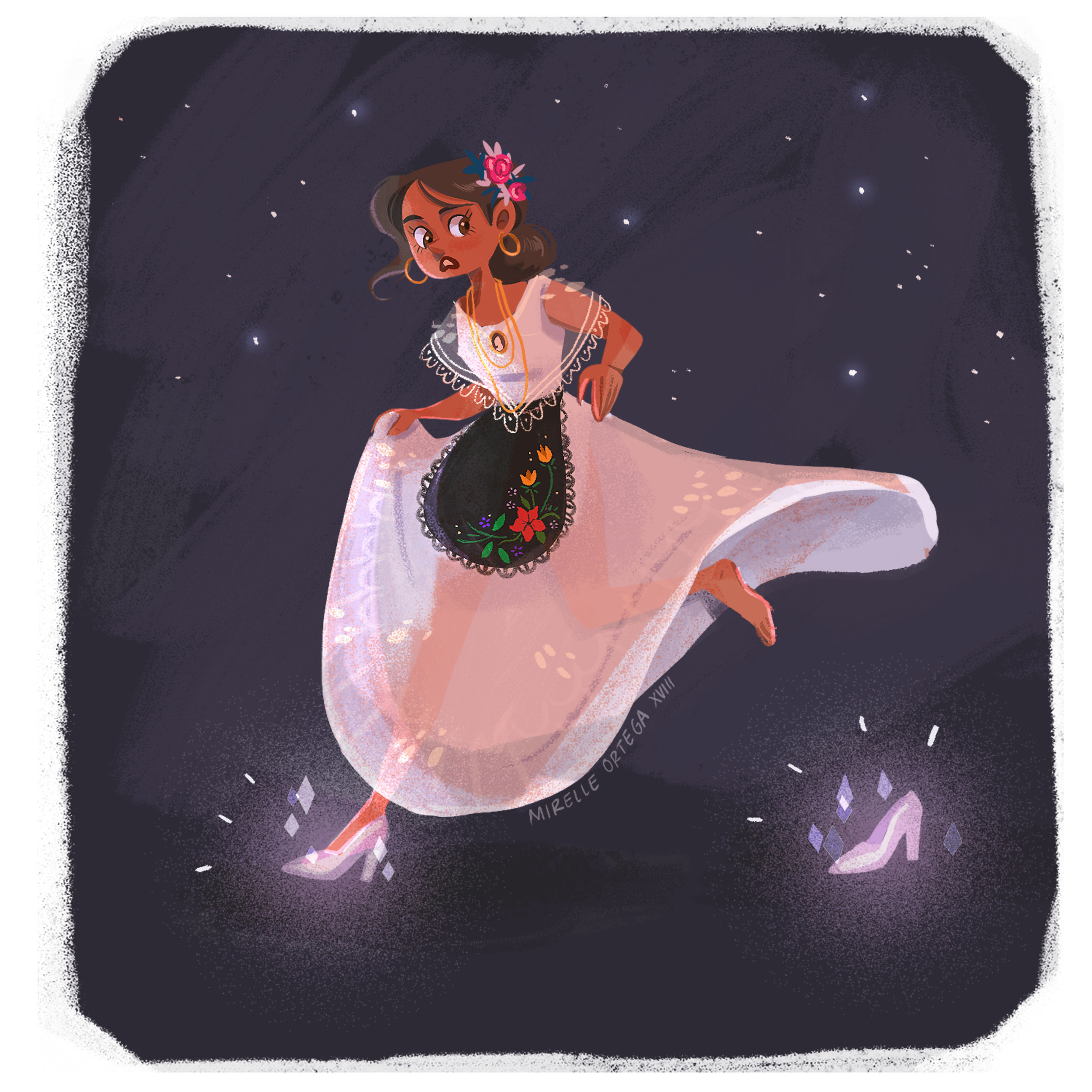
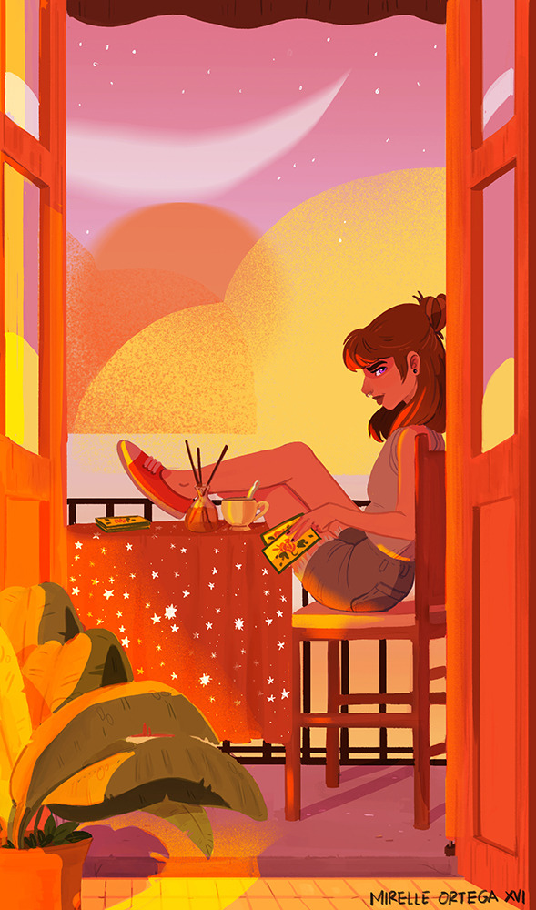
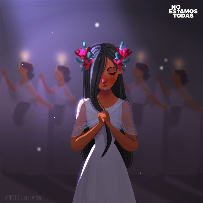
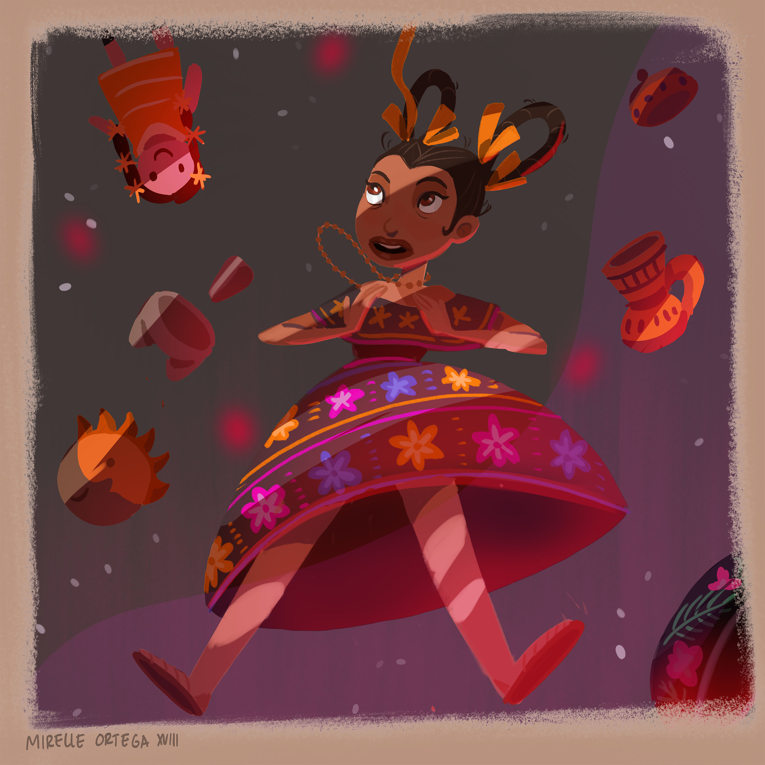
I am naturally drawn to bright and saturated colors, which I think it’s something very present in Mexican culture and art. I feel very at home with vibrant palettes, and the book itself felt very vibrant to me.
Were there any early sketches or ideas for A Dash of Trouble that didn’t make it into the final version?
Yes and no. We settled on the composition itself (the room, the oven and the flying pigs) very early on. There were some minor iterations on where would Leo be positioned, and then just a lot of work went into making Leo very distinctive. So, from the first sketch all the key elements were present, and then it was just tweaking until we got exactly what we wanted.
Every artist has their own workflow. Could you share a little about yours? What are the major steps of your creative process?
When it comes to book covers, I start by reading the brief very carefully. If I get the full manuscript, I read the manuscript next. I love this part of my job, because I LOVE reading, and I love reading middle grade. To me it’s just magical the way authors find ways to take big concepts about life and put it in words that are accessible to younger readers.
I usually finish reading the manuscript that same day, and then I just sit with it for a couple days. Sometimes I doodle my first impressions of the characters or a quick scene or two that I thought was particularly charming. I also do this really weird thing, in which I like thinking what song/type of music the cover would be. I have sound-color synesthesia so this really helps me think of what colors I would like to lean on later on.
Then I go to sketch for the final composition. I do a bunch of tiny thumbnails and pick my favorites, and then I clean up one or two of those. I usually get very specific ideas from the author and the designer, and that really helps narrow down what scenes I’m drawing or if there are some specific things they really want to see. I think the character is really important, so I usually spend most of my time designing a compelling character that I feel represents the spirit of the book.
I then send the first round of sketches and wait for feedback. It’s a very collaborative process, so after the initial round of feedback I tackle all the notes and we move from there. After we’ve settled on a sketch, I create some rough color sketches. If we’ve already agreed on a color scheme, then that step goes really fast. If not, I try to bring some variety so that there are more options to go around. Once we’ve decided on a color scheme, I move on to final art and polish the final illustration.
Who or what would you say inspires and influences your art the most?
I think my art is heavily inspired by my culture and personal experiences – which, to some extent, are one and the same. I also draw a lot of inspiration from media: animation, music, film and -of course- books! Basically, every time something makes me feel something, I want to turn that into artwork.
How can members of the bookish community better support book cover illustrators, such as yourself?
I think that something as simple as making a small note crediting book illustrators and designers in articles, blog posts, or book reviews could go a long way. Also, doing awesome features like the ones you’re doing! {Kat: Dawwww, shucks, I’m blushing //////} And, of course, buying the wonderful books we create covers for!

Mirelle Ortega is an illustrator and concept artist based on the LA area. She’s originally from the south east of Mexico, and has a passion for storytelling, sci-fi, film, tv, color and culture. Mirelle has a BFA from the Tecnológico de Monterrey (Monterrey, Mexico) in digital art and 3D animation, and a MFA from Academy of Art University in San Francisco. She is fluent in Spanish and English.
Her Website // Her Instagram // Her Twitter // Her Tumblr
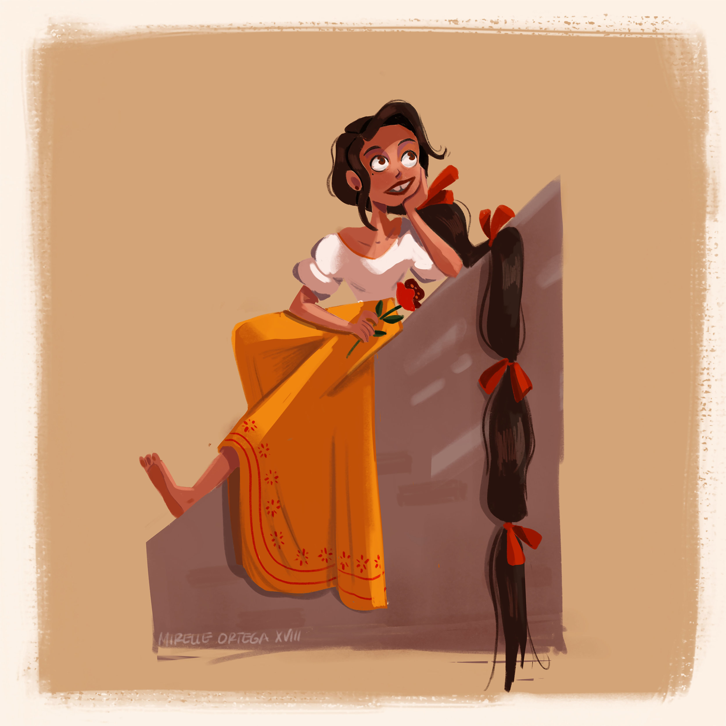
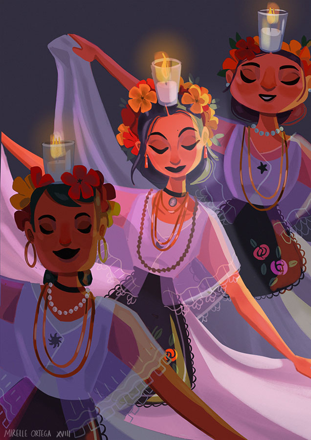
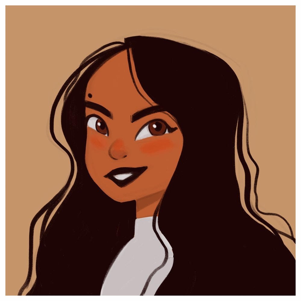
**All images in this post are included with the artist’s permission**
Thank you so much, Mirelle, for taking time out of your busy schedule to go undercover with us and explain a bit about your work as a book cover illustrator!
9 Comments
Write Your Waffling


Trending Posts


Omg the art is beautiful!!! So many colors, and everything complements so well! Mirelle is truly talented, and after looking at all those beautiful illustrations I immediately felt happier :)
I love this series so, so much! I now take a look at the back flap to check out who did the cover design, when I come upon a cover I love! But I think one of my favorite things about this series is how you have the artist’s other works interspersed throughout the post, so I can get a sense of their style and how it translated into the cover they designed!
Wow the art is so beautiful!! I love the bright colours and the style!! And it was great to see Mirelle talk more about the process– I like that she puts a song with the cover to help her imagine it and put the colours on.
Yes I try to put credit for the artist cover on my posts more– and I love it when the backs of books give credit to the artist and team!! And of course this lovely blog series is great to hear more from cover designers– it is lovely!!
Great interview!! And I hope you are well!! 💛
I love this feature, it gives a really interesting look into what makes a book cover. Everyone loves to look at pretty book covers, but no one ever seems to talk about where they come from!
I especially love when you do these posts, because as someone who likes to draw they’re super inspiring!
*GASP* Flibbertigibbet!!! KAT, WHEN DID YOU GO SELF HOSTED!? YOUR BLOG IS EVEN MORE GORGEOUS THAN IT WAS BEFORE (I didn’t think that was possible!)!! I love it so much!!! Ahhhh! <3 <3 <3 I want a button that allows me to like a website, 3000 times!
Also, this is such a fun interview! Mirelle sounds like such a wonderful person, and her artwork is stunning! (Also, hi! Fellow Los Angeles native here! Hehe. :) ) I love how she draws inspiration for some of her artwork, from her own experiences and culture. I think that's a marvelous way of adding a personal touch to her illustrations!
Shhhhh it’s still a secretttt hehe. I’m still working the kinks out. BUT OH GOSH. THANK YOU SO MUCH ❤️❤️❤️I’m so glad that you like it as much as you do !!!! I’m pretty fond of it myself.
And isn’t Mirelle so awesome! Her illustrations are just 👍👍👍
Thanks for your kind words and support, as always :)
I had somehow gotten a WP notification about a pingback for one of my posts in your February wrap up, and when I clicked on it, it brought me to the new domain! I can’t wait for you to go public with the new site!! <3 xX
How fun that the author actually discovered this illustrator via Twitter. That’s an unusual story! And it’s also really interesting that Mirelle has sound-color synesthesia and that it influences her artwork. :-)
It just goes to show that social media really plays a vital role in today’s world – especially for artists! Thanks for the lovely comment 💛