
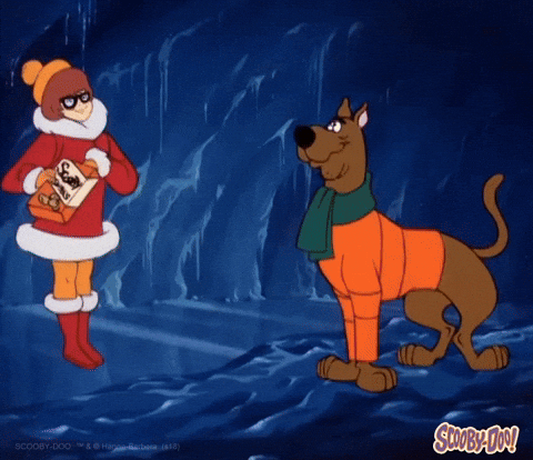
When I was a kid, every Friday night my mom would take my younger brother and I to our local Blockbuster Video so that we could rent a VHS (wow, there are so many things in just that one sentence alone that make me feel old. Excuse me while I go grab my fake teeth and walker).
In any case, my brother and I went through a months-long phase where the only tapes we wanted to rent were Scooby-Doo (I just want to take a moment here to apologize to my dear mother, who got very tired of this very quickly).
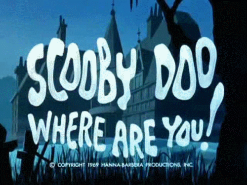
I’m not exactly sure what it was about this show that got us hooked; maybe it was the way that every episode had Velma scrambling around for her lost glasses. (As somebody who can’t see her own hand in front of her face without glasses, this always spoke to me on an emotional level.) Or maybe it was how Scooby-Doo and Shaggy could always be bribed with food (because #SAME). But in all likelihood, it was that my brother and I had discovered a well-known fact: everybody loves a good mystery.
There’s just something about the unknown that we, as humans, love – it sparks our curiosity like a flame to a wick. Don’t believe me? Then why, pray tell, does Mr. Tall, Dark, and Handsome always have a mysterious secret? It’s because, for some strange reason, it makes him more attractive. But, contrary to popular belief, not everything is always better left a mystery.
Take artists, for example. With the way the internet works nowadays, a beautiful piece of art can be reposted, repinned, and retweeted, leaving the name of the original creator a sad mystery that not even Scooby-Doo and the gang can solve. Book covers and the talented illustrators behind them are no different. They, too, can fall prey to this unfortunate plague of anonymity. Zoinks! Isn’t that just awful?
It shouldn’t be as hard as it sometimes.
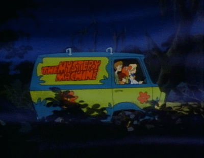
But have no fear! Today on the blog, book cover illustrator, gg, has graciously agreed to help us unravel part of that mystery. So, without further ado, let’s all pile into the Mystery Machine and go undercover. And who knows? Maybe at the end, we’ll all get a Scooby Snack!
Please tell us a bit about yourself and how you broke into the illustration industry.
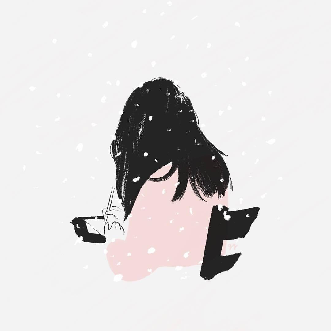
My name is gg, which is just a stylized way of writing “Gigi”, and sometimes you might find my work credited to “ohgigue”, which is just a word I made up. I’m from Alberta, Canada. I studied art/art history in school but I didn’t study illustration. I’ve been drawing all my life but I only really started focusing on illustration about 4 years ago when I started making comics and self-publishing them.
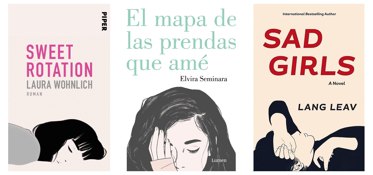
I’m still not sure if I’m “in” the illustration industry, since it is not something I actively pursue – the cover work I have done has just been through random invitations. The first covers I did were because of my drawings floating around Instagram and Pinterest. Art directors started emailing me about using a particular image for covers they were working on. The first one was Sweet Rotation by Laura Wohnlich for Piper Verlag in Germany. From there, it just naturally progressed from more licensing and eventually to actually doing original commissions. I’m not really sure how exactly it all happened!
Most of us readers know very little about how a book cover comes into existence. What can you tell us about the process?
Again, no one should take what I say as a typical way for how these things work because I feel like I somehow stumbled upon this without looking for it. As I mentioned above, there have been two ways for me. The first is someone asking to license one of my existing drawings for a cover. An art director will email me about a drawing of mine that they saw somewhere and ask if it is available and, if it is, we make an agreement on the fee depending on how, where, and for how long they want to use it. That’s about it. In those cases, I don’t really have any input in the final design (typography, colour, etc.) I just have to cross my fingers and hope it turns out okay.
The other way is a commissioned original work. This is more of an involved and collaborative effort with the art director (and by extension, with a group of people consisting of editors, sales people, and the author.) I receive the manuscript and some mood boards and a general direction and then I try to connect it all together in an image.
Who else do you usually work with on a book cover and what is it like?
My main person of contact is the art director. I have spoken to authors on occasion, but in most cases, the art director acts as the go-between for everyone. My experience with art directors have all been pretty great. Doing a commissioned work is more fun because the collaborative nature of working that lets me push things in directions that I may not have if I was just left to my own devices.
Do you usually read a book before you start illustrating its cover? If so, out of the books you’ve illustrated, which ones have you felt the strongest personal connection to?
For the licensed work, no – I wish I could, but the turnaround on those is so quick. I’ve only done two commissioned covers so far (one I just finished a week ago) and I read those manuscripts before starting. I did feel a strong connection with Penny from Emergency Contact. Her awkwardness and anxieties were things that I really identified with. It was really easy to picture her in my mind before I even drew her.
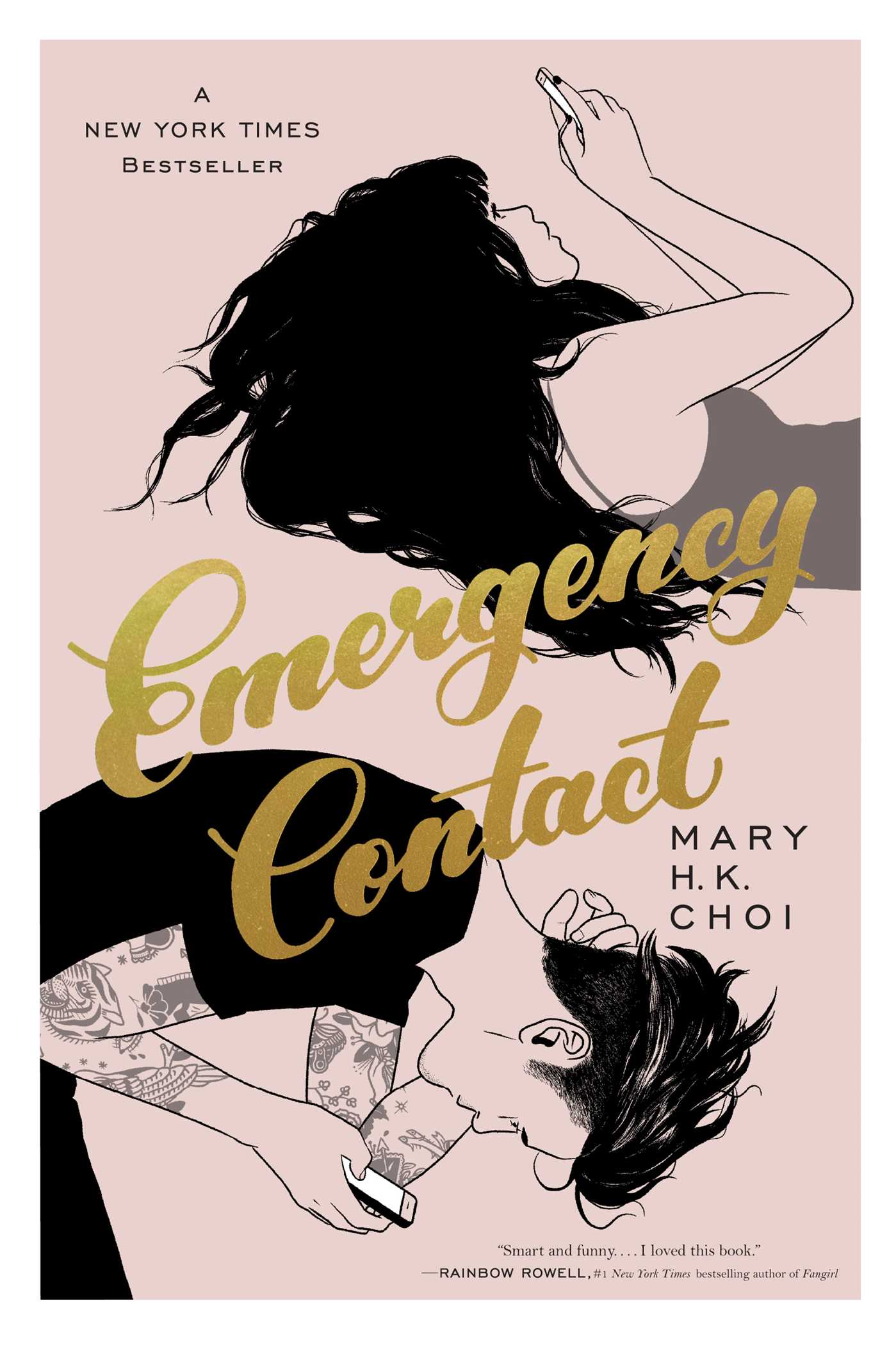
I absolutely adore your use of strong black lines and soft, pastel pink in the Emergency Contact cover. What was your inspiration for this piece?
I think my wonderful art director, Lizzy Bromley at Simon & Schuster, asked me to do the cover because of the colour palette I normally like to work with – which is immediately obvious if you look at my Instagram. The book begins with Penny admiring the rose gold colour of her iPhone and that was the first touchstone for the look of the cover.
Lizzy sent me a mood board of drawings of mine that she liked from Instagram and just told me to do my thing! It’s important to me that the cover feels tailor made for the book so I want to include as many visual details as I can to make it feel more specific. Like Penny’s hair, Sam’s tattoos and wiry body, the clothing they wear, etc. So I guess I try to find my inspiration within the story itself.
Were there any early sketches or ideas for the Emergency Contact cover that didn’t make it into the final version?
The first drawing for the EC cover was pretty close to the final. It was approved after I submitted it and so most of the time was spent tweaking the details. I originally had Sam shirtless and more disheveled with some stubble – I had wanted to highlight his “skeleton” body, as described in the book. In the end, we decided to put a shirt on him and clean him up a bit because he was looking a bit older than he should. I also had a more random collection of tattoos on him but, upon the request of Mary, the author, we decided to take some liberties and unify them into one style to be more aesthetically pleasing on the cover. I wanted to keep the tattoo of the blindfolded knight chess piece because that is the one tattoo that is actually described in the text.
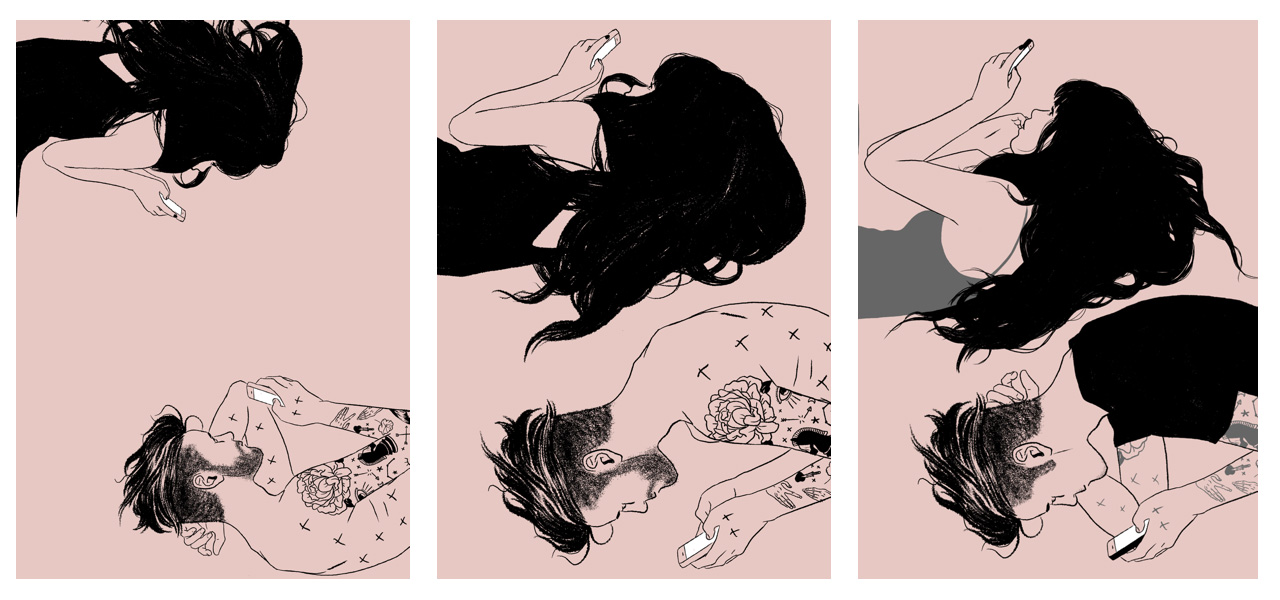
There were other minor adjustments like arm placement, etc. I left whether they should be facing each other or facing away up to Lizzy. Both ways seemed to speak to the story in a slightly different manner. In the version where they are facing each other, I have their eyes pointed so that they are meeting each other, looking over and beyond their phone screens. I think a big moment in the book is seeing beyond their little phone realities at the real person. In the facing away configuration, it was more about their proximity on the page where it looks like they are laying next together in the same space but they can only communicate through these screens.
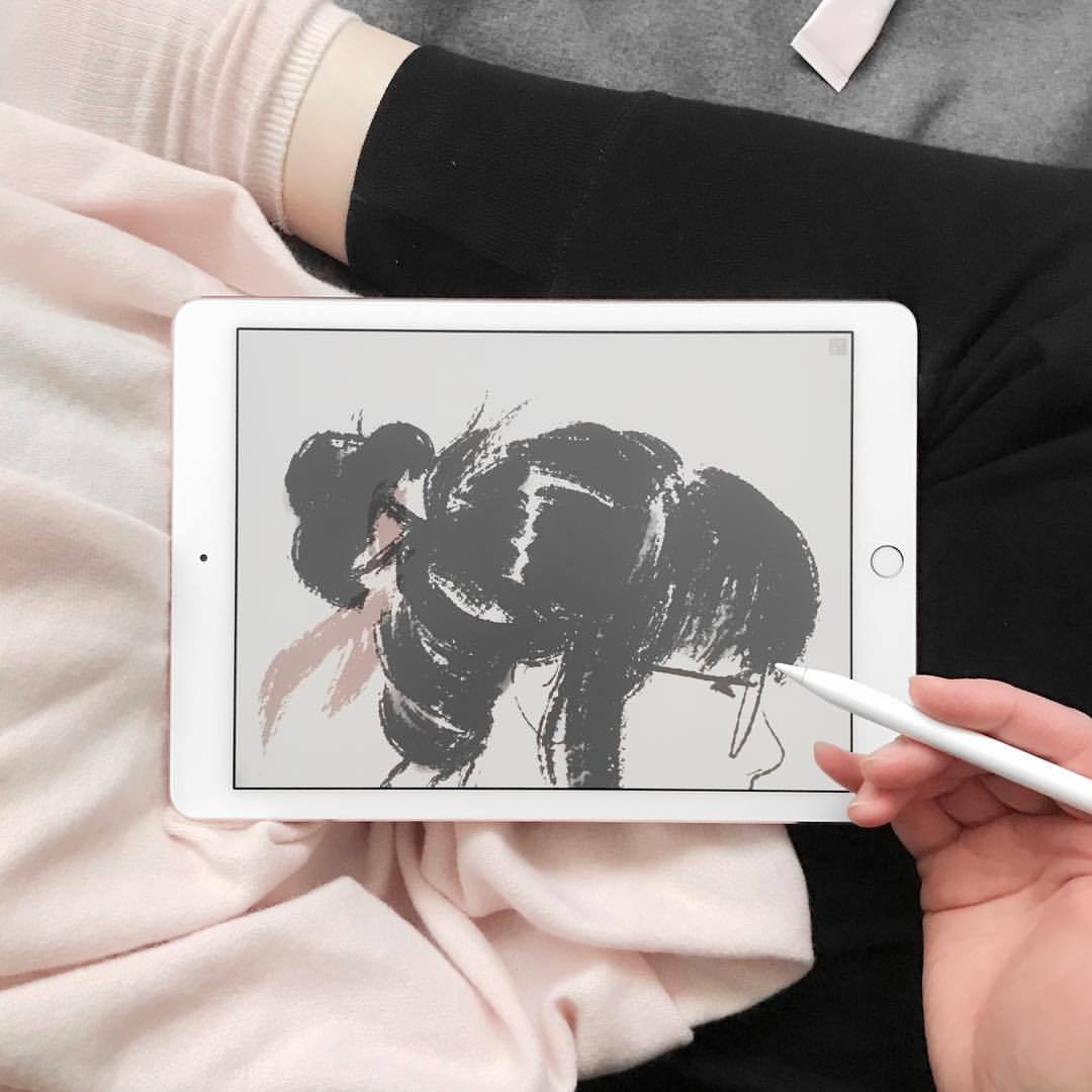
Every artist has their own workflow. Could you share a little about yours? What are the major steps of your creative process?
When I read a manuscript, I highlight everything that describes visual details. Hair, clothing, tattoos, posture, body type, colours, and so on. By the time I’m finished reading, I usually have a pretty clear idea of what I want to draw based on scenes that stayed in my memory or a general feeling I have about the story. But it’s good to have the highlighted manuscript to reference occasionally when I forget the exact description of something. Because there are so many different scenes that happen over the course of a novel, I also try to look for themes and recurring concepts and use that to frame how I want the cover to look.
For example, the idea of the phone as a thing that brings these two people together but also is a barrier between them. After I fill my head with these ideas, it becomes more intuitive as I just try to make a drawing that is evocative and (in my opinion) looks nice. Apart from the materials I receive from the art director, I also do some research of my own. Again, I like to make the cover specific to the book so sometimes I need to find out things like, “what does this mundane object look like in this city that I’ve never been to?” The internet is my best friend here.
Who or what would you say inspires and influences your art the most?
This is always a hard question. I try to be inspired by everything. I try to read, listen, and watch a lot of different things in all genres. I like to observe everyday life. I like to observe my feelings and emotions and I like to write down my dreams when I remember them. For the type of work I do, I think it’s important to just be open to as much as I can be. More specifically, I suppose I’m attracted to things that elicit deep emotions in me – or at least that is how I choose what projects I’d like to work on.
What piece of artwork are you most proud of? Why is it your favorite?
It’s difficult to choose a favourite because everything I put out there is something I am proud of. If I’m not proud of something I’ve made, it’s promptly put in the garbage and no one will ever know about it. I’m always trying to improve with each new project so the last thing I’ve made and released should, in theory, be the thing I’m most proud of :)
How can members of the bookish community better support book cover illustrators, such as yourself?
I think sharing the work with proper credit is the best thing to do. In my experience, all the covers I’ve done are because art directors were able to track me down after seeing my work on various social media sites. Often, on the internet, the creator of an image gets erased and the work becomes orphaned. I don’t think it’s malicious most of the time, it’s just that there’s no real etiquette for citing sources. You can also support artists just by following them on social media or, if you have the means, by checking out their personal projects or things like Patreon. Illustration work is nice when you can get it but sometimes there are long periods in between and during this time most of us are probably just working on personal work for little to no pay.

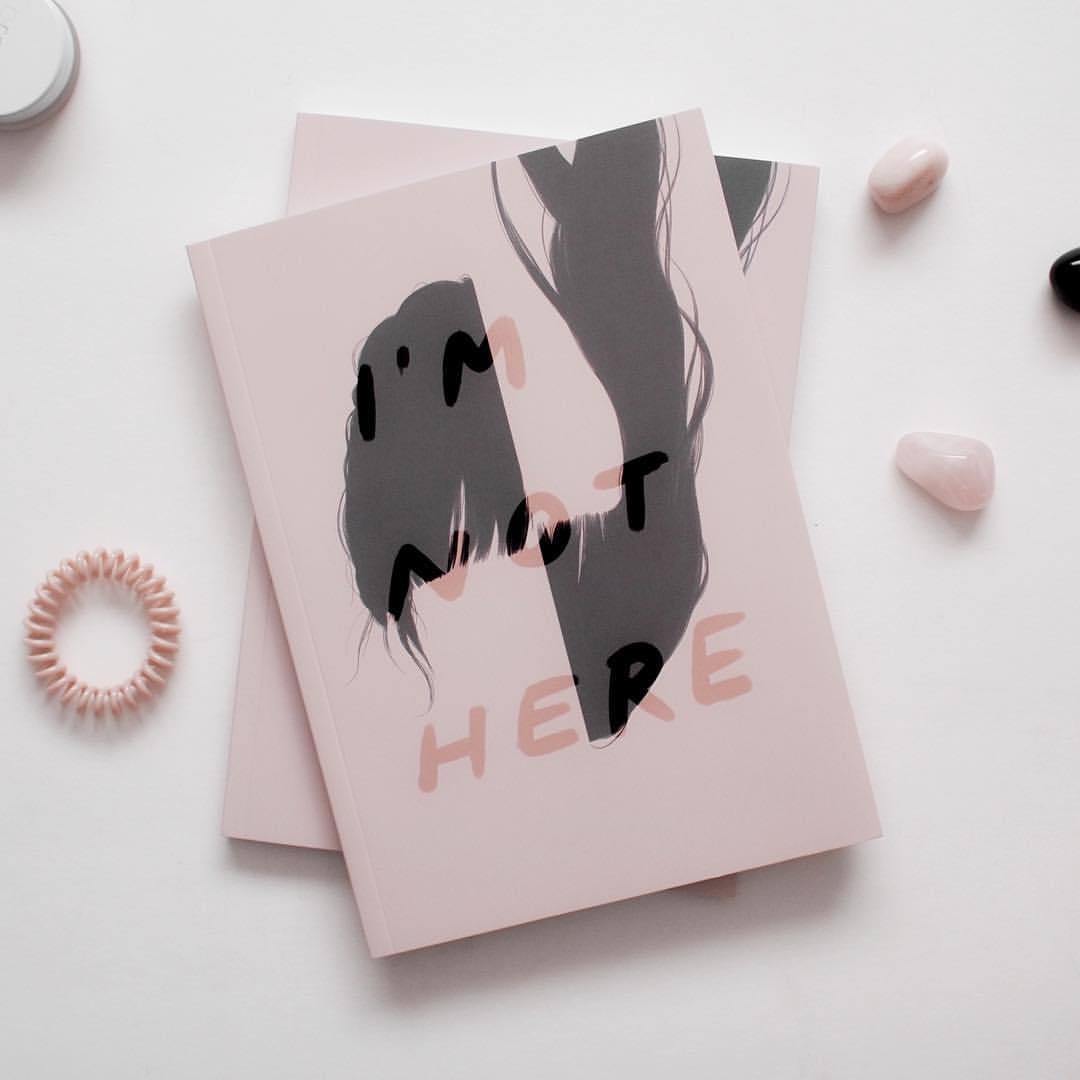
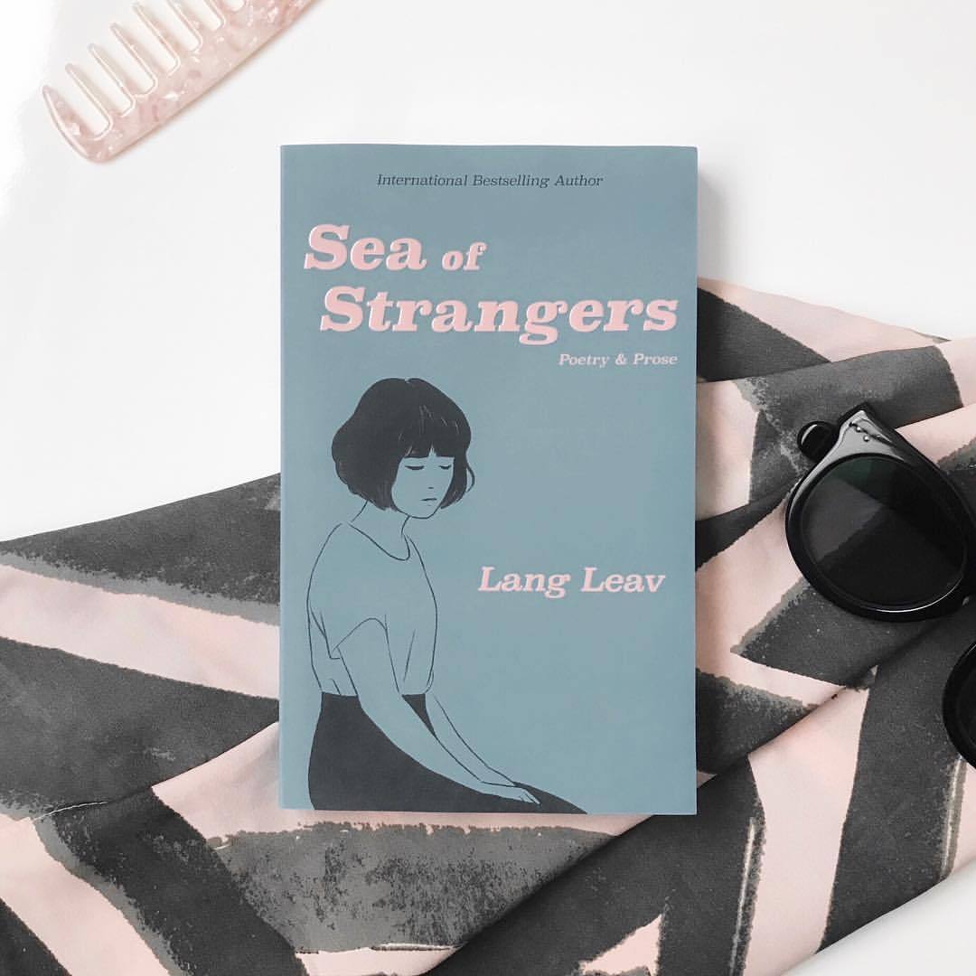
gg makes stories with drawings. Most of them are about feelings. Most of them are about sad feelings. Some of the things she’s made include: her graphic novel, I’m Not Here, published by Koyama Press; her self-published mini-comics which are available to read on her website; and her cover illustrations for books such as Emergency Contact by Mary H.K. Choi and Sad Girls by Lang Leav.
Her Website // Her Instagram // Her Twitter // Her Tumblr // Her Pinterest // Her Patreon
**All images in this post are included with the artist’s permission**

Are you as in love with the Emergency Contact cover as I am?
What do you think of gg’s artwork? Isn’t it so beautiful?
How do YOU think we can better support book cover illustrators?
12 Comments
Write Your Waffling


Trending Posts


I’m in love with Emergency Contact period. But, the artwork on the cover is possibly my fave of all the books I’ve read this year. Thank you for finding and interviewing gigi!! This post is so lovely and informative. 💕
Fun fact: I still own some VHS tapes and one of them is scooby doo 😂😂
And I love the emergency contact cover so much— I just mentioned in a post and I am going to go back and credit gg. I have been meaning to credit artist more on my blog so you just reminded me so thank you!!
I love the style and the colour palette!! So amazing!! I am definitely going to go and follow her stuff!! 😍
Great interview!!
I kind of screamed when I noticed that post, because I am so in love with Emergency Contact’s book cover, have been ever since it was announced and still am right now, it’s most likely one of my favorite book covers of all times .It’s amazing to know more about the artist and I loved seeing more of her artwork <3 Thank you for sharing! :)
This cover is sooo beautiful <3
Lovely post, a great read in the morning :) I love gg’s style and I also find it very interesting the process through which her art becomes book covers (in the 2 ways she explained).
I can’t wait to get round to reading emergency contact! The cover is just so 👌 – I love gg’s art style! 💕
I love this series you’ve been doing with these book cover illustrators! At one point in my life, that’s what I wanted to do – not now but I can imagine how great this content is to other aspiring book cover illustrators out there. Emergency contact was a great read and seeing some of the cover drafts is awesome!
This post is amazing! It’s so interesting to be able to get a behind the scenes look at the work of cover artists. Also, Emergency Contact is one book that I absolutely love the cover. I bought and read it solely because of the adorable cover 😍
Scooby Doo fan here! Great interview with gg. I am in love with the cover Emergency Contact and remember seeing it everywhere. I love her use of pink, black and pastels. I think we can better support cover illustrators by recognizing them more. I plan on finding gg’s graphic novel because I bet it is amazing!
[…] Here are some book covers that Jess has doing the lettering for. Incidentally, the final cover illustration for Love Looks Pretty On You was done by the artist gg, who I have also interviewed on the blog. […]
[…] design industry but dreams of one day being a book cover designer! (see Kat’s latest posts where she interviews actual book cover designers and scream along, alright?) Kyle works in the […]
Interesting to hear how the cover designer’s typical color palette worked so well for Emergency Contact. Thanks for this interview!